REDESIGN | UXR | UX | UI | DEV
I redesigned the product portfolio page for Co.lab students and graduates. After conducting in-depth user research and gathering feedback from business stakeholders, I developed several solutions to address current issues and support future business development goals.
June-July 2024
Helen Huang
Polina Vinnikova
Francis Del Rosario
Figma design and prototyping
FigJam collaborative sessions
Google Sheets data analysis
Webflow website building
User research
Information architecture
Interaction design
Visual design
No-code development
Co.Lab is an educational program for tech professionals that provides a real-world experience building tech products in cross-functional teams. Co.lab runs educational programs every two months, with each program hosting 5 to 10 teams.
Teams consist of four students in different roles: one product manager, one product designer, and two developers. Upon graduation, students document the process of building their products, creating portfolios that showcase their work and experience. These portfolios are featured on Co.lab's website and can be shared with potential employers or others in the industry.
The task from the Co.lab team and stakeholders was to redesign this portfolio page to address current user issues, enhance shareability, and attract potential students.

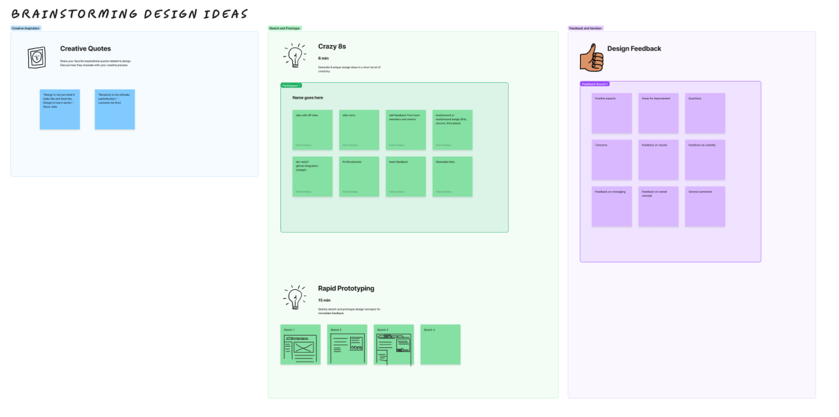
After conducting in-depth interviews with three key stakeholders of Co.lab and thoroughly analyzing their responses, I identified four main pain points with the current product portfolio page and gained valuable insights into their vision for its future.

The current portfolio page design is not optimized for mobile devices, making it difficult for users to view and interact with the content on smaller screens.

Students lack the ability to personalize their portfolio pages, hindering their ability to showcase their individual personalities and unique contributions.

The process for uploading and editing content is cumbersome and time-consuming for both students and staff, and students cannot update their product packs after submission.

The current design does not make it easy for students to share their portfolios or specific sections, limiting the potential for organic reach and promotion.
The project had three specific requirements from the stakeholder:
UXR
To gain a deeper understanding of user perspectives and identify the changes necessary to enhance the portfolio page's usability and shareability, I conducted a survey involving 27 Co.lab graduates and students. This survey aimed to uncover their current interactions with the page and gather insights into the features and functionalities they value most.
In their responses to the Co.lab student survey, participants highlighted several key areas where the portfolio page could be improved to better showcase their work and experiences.
These findings underscore the need for a portfolio page that not only showcases the final product but also effectively communicates the process, collaboration, and individual contributions that went into each project. By addressing these areas, Co.lab can empower students to create more impactful and personalized portfolios that resonate with potential employers and collaborators.


Students desire more comprehensive and engaging content that tells the story of their projects, including visuals, details about collaboration, and individual contributions.

Participants suggested clearer headings, more intuitive navigation, and better signposting to guide viewers through their portfolios.

Students expressed a strong desire for greater flexibility to tailor their portfolios to their individual preferences and highlight specific skills or projects.
THE DESIGN GOAL
IDEATION AND PRIORITIZATION
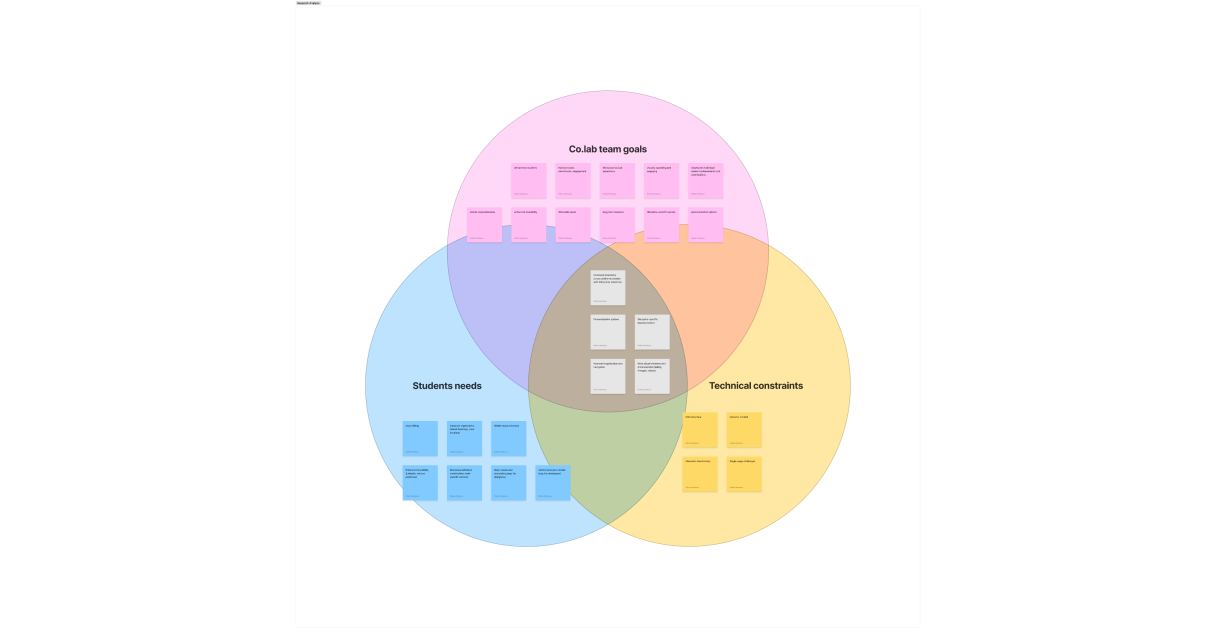
I focused on finding effective solutions that successfully address the business goals outlined by the Co.lab team and resolve current user issues.
A critical aspect of this process involved considering technical constraints, particularly because the website is built on Webflow.
Understanding and utilizing Webflow's CMS collections and collection lists was essential requirement for implementing these solutions.
DESIGN AND PROTOTYPING
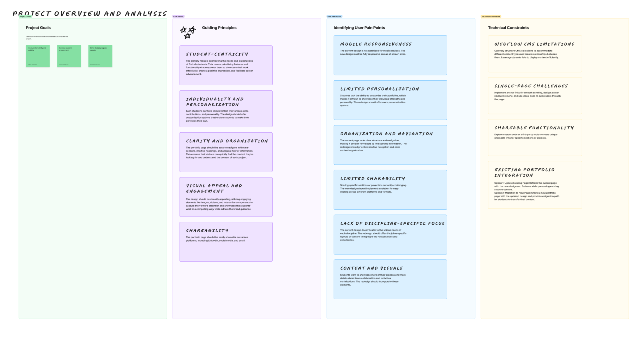
To successfully address the identified challenges and meet Co.lab's goals, the ideal solution for the portfolio page should effectively showcase both team collaboration and individual professional roles.
It must prioritize intuitive navigation, personalization options, and easy shareability, all while considering the technical constraints of Webflow's CMS and collection lists.
This approach will empower students to present their unique contributions and accomplishments in a compelling and shareable format, ultimately enhancing their career prospects.
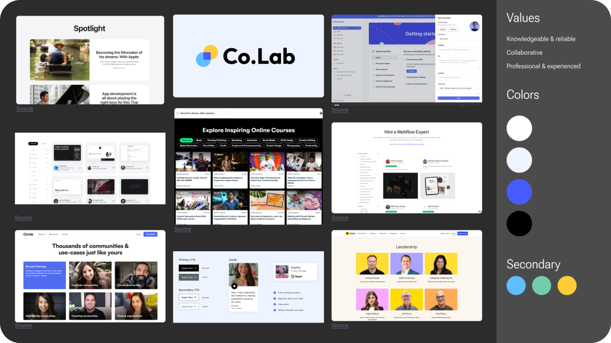

The new design ensures optimal viewing and interaction across all devices, from desktops to tablets and mobile phones.

A user-friendly sidebar navigation streamlines searching through the portfolio, allowing users to quickly access desired sections.

Students can now easily edit their own portfolios via a dedicated form page, eliminating the need for direct interaction with the Webflow structure.

Personal learnings and mentor feedback are prominently featured at the top, catering to users' desire for shareable and personalized content.
THE SOLUTION
In contrast to the existing single-page portfolio, I propose a one-page solution featuring distinct tabs for each student's individual role.
Initially, upon accessing a portfolio, users land on a team overview page showcasing project highlights, collective feedback, and key learnings.
From there, users can easily switch between tabs to explore individual professional roles – product manager, designer, or developer – each accompanied by personalized feedback and mentor insights.
To enhance personalization and encourage sharing, I redesigned the portfolio page to prioritize individual achievements and personal growth.
I moved photos to the top, prominently displayed personal learnings, and showcased mentor feedback for external validation.
This focus on personalization aims to create a portfolio that resonates with each student's unique strengths and aspirations, making it more likely to be shared and celebrated.
The potential addition of teammate feedback was discussed but reserved for a future iteration, allowing us to focus on delivering the most impactful personalization elements within the current scope.
Navigation was another major concern raised by users. The existing portfolio page, consisting of a single scrolling page filled with text and images, proved cumbersome to navigate.
To address this, I implemented a sidebar menu which allows users to easily jump to specific sections by selecting them from the menu, significantly improving navigation.
For tablets, the sidebar can be collapsed and expanded as needed to optimize space.
On mobile devices, the sidebar transforms into a sticky top menu, ensuring effortless navigation across different screen sizes.
To address the lack of team-focused content, I introduced a dedicated team page that serves as a landing page for portfolio visitors who come from the portfolios page, not outside links.
This page prominently features all team members, highlighting their profiles, roles, and online presence, while also showcasing collective learnings from the program.
This addition reinforces the value of collaboration, a key aspect of Co.lab's educational approach, and enhances the individual shareability of each student's portfolio by leveraging the team's collective success.
ITERATION AND PRIORITIZATION
A significant challenge arose when stakeholders didn’t like the tabbed navigation concept.
This presented a bottleneck as tabs seemed essential to address all user pain points within the existing technical constraints.
Finding an alternative solution that maintained the core improvements while avoiding tabs became a new challenge.
After extensive research, exploration, and discussions, I refined the solution. While similar to the original concept, it eliminated the use of tabs.
The team page remained the initial landing point, showcasing team members and collective learnings.
However, individual team member cards now serve as navigation points instead of tabs.
Clicking on a card redirects users to that student's dedicated portfolio page, which is individually shareable and editable.
This revised approach successfully addressed the stakeholder concern while preserving the desired user experience.
Usability testing also revealed a few issues.
Additional iterations included removing a video from the team page to focus attention on the individual member cards and replacing it with a representative portfolio card image to illustrate the purpose of clicking through.
This iterative process, coupled with user testing, allowed for continuous refinement and ultimately led to a solution that met both user needs and stakeholder expectations.
IMPACT AND OUTCOMES
I believe I successfully accomplished this project by designing an ideal solution that addresses user pain points and meets business goals. Through thorough research at the project's onset, including stakeholder surveys and user interviews, and a deep understanding of technical constraints, I narrowed down the options to the best possible solution.
While the page is still in development and I don't yet have product metrics yet, usability testing has shown a 9 out of 10 Net Promoter Score and overwhelmingly positive feedback on the visuals, ease of navigation, and professional appearance. As soon as product metrics are available, I will update this section.
LEARNINGS
Overall, this project was a highly positive experience. I enjoyed working with the Co.lab team, who were organized and supportive, fostering a comfortable design environment with ample creative freedom. This project also yielded several key personal learnings:

While my existing knowledge of Webflow and CMS was sufficient for this project, I realized the importance of staying up-to-date with the development side to ensure my design solutions are not only creative but also technically feasible. This will enable me to better communicate and collaborate with developers and decision-makers.

This project reminded me of the value of effectively communicating design choices. In advocating for user needs, I revisited resources like the book "Articulating Design Decisions" by Tom Greever to refine my communication skills and ensure I am both persuasive and professional in presenting my ideas.

Despite time constraints, I learned that visually presenting research findings and design solutions is highly effective in engaging stakeholders and facilitating discussions. In the future, I will prioritize creating presentations to walk stakeholders through my design process and foster collaborative decision-making.