╳
L

UXR | UX | UI | DEV
I designed and developed a responsive, mobile-first website for a documentary photographer's portfolio.
Through user research and collaboration with branding and marketing teams, I ensured the website seamlessly integrates the brand identity and highlights the photographer's exclusive services.
Feb-Mar 2024
Lili Ovdienko
Polina Vinnikova
Lesia Mazepa
Figma design and prototyping
Whimsical wireframing
Sqarespace website building
User research
Information architecture
Interaction design
Visual design
No-code development
Lili, a talented photographer specializing in family, maternity, and event photography, recently relocated to Barcelona and needs to establish her business and attract new clients in this unfamiliar market. To do this, she requires a professional online portfolio website that effectively showcases her work, appeals to her target audience (families with children in Barcelona), and communicates her unique brand identity.
This project addresses Lili's need for an online presence by creating a visually appealing, user-friendly, and bilingual (English/Ukrainian) website that resonates with her target market. This involves crafting a captivating narrative, optimizing the site for cultural nuances, and ensuring a seamless browsing experience across devices.
In a world where memories fade, distance separates, and legacies can be forgotten, Lili's photography offers a timeless solution. Her photographs capture precious moments, connect families across the miles, and create lasting heirlooms that tell the story of a family's love and joy.
Time flies, and precious moments with children can be easily forgotten. Lili's photography can capture and preserve these fleeting memories, allowing families to cherish them for years to come.
For families separated by distance, Lili's photographs can serve as a bridge, allowing them to share and celebrate life events with loved ones who can't be there in person.
Lili's photographs become treasured family heirlooms, passed down through generations, telling the story of a family's love and joy.
Family events, like holidays or vacations, deserve to be commemorated. Lili's photography can capture the unique atmosphere and emotions of these special occasions, creating lasting memories.
UXR
A survey conducted with 8 women, representing Lili's target audience, revealed valuable insights into their preferences for photographer websites. The primary goals of the survey were to understand user preferences, identify pain points, and gauge interest in additional services. The participants were diverse in age, location, and profession, providing a broad perspective.
Participants overwhelmingly use their smartphones to search for and research photographers, highlighting the need for a mobile-optimized website.
The photographer's portfolio is the most critical factor in choosing a photographer, emphasizing the importance of showcasing high-quality images in an easily accessible format.
Users value authenticity to get a better sense of the photographer's personality and seek photographers who can capture genuine emotions and tell a story through their images.
THE DESIGN GOAL
IDEATION AND PRIORITIZATION
Grounded in user-centric research, I led the design process to ensure it met user needs and aligned with market trends.
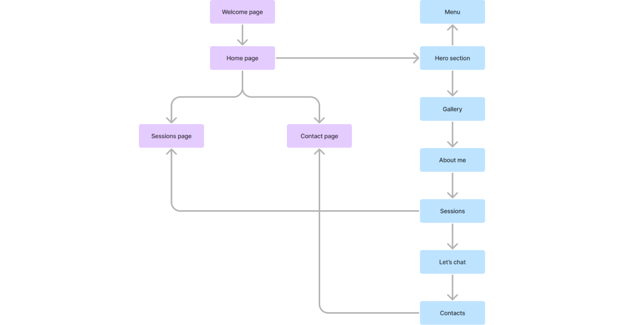
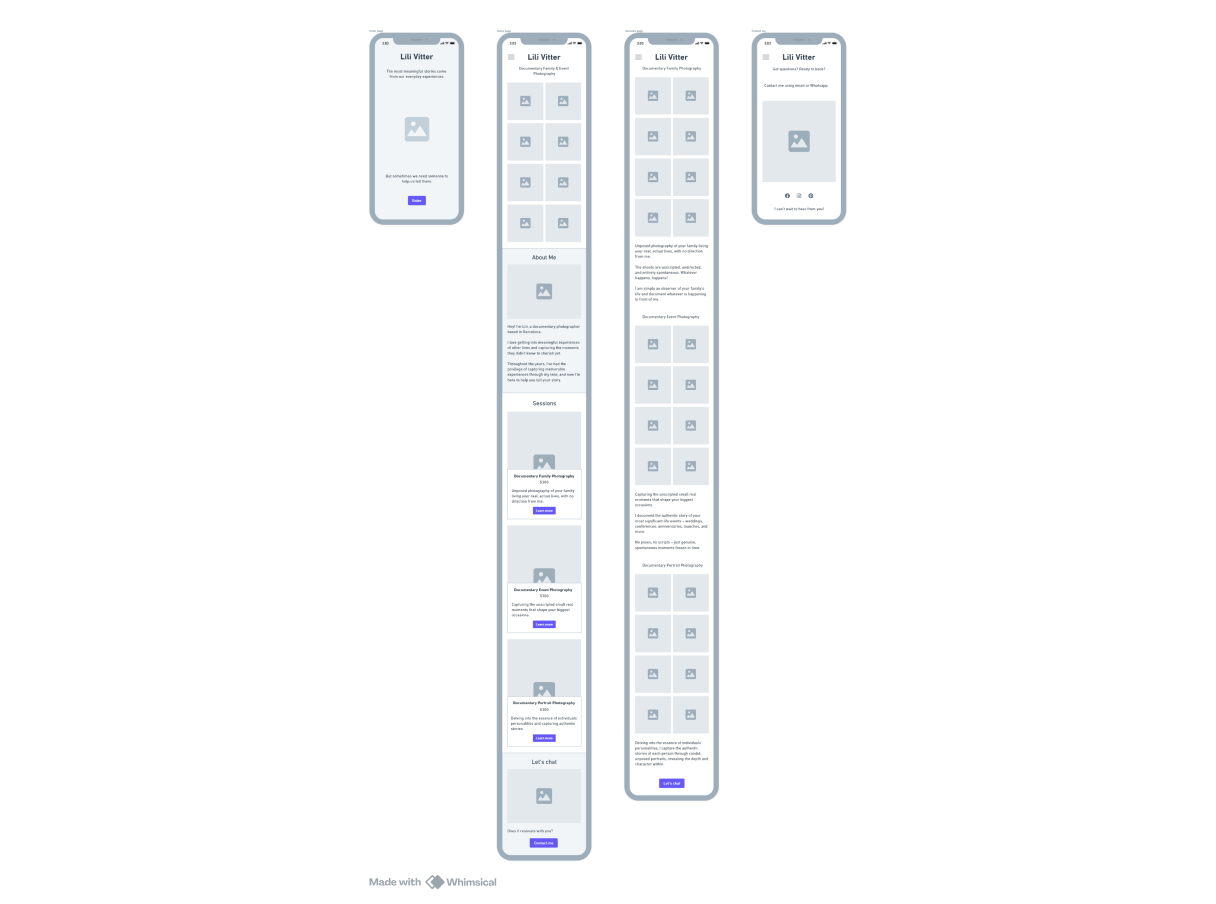
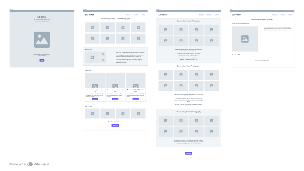
Users land on a visually captivating welcome page, then enter the main page featuring a portfolio grid, an "About Me" section, and a service overview.
The CTA is a prominent contact button.
Additional pages, like sessions page and contact page offer more session details and alternative contact methods.
DESIGN AND PROTOTYPING
I took the lead in establishing a comprehensive design system to bring my vision to life and maintain a cohesive look and feel throughout the user interface.
Working closely with the branding and marketing team, we carefully crafted a palette of colors and fonts that prioritize both aesthetics and readability.
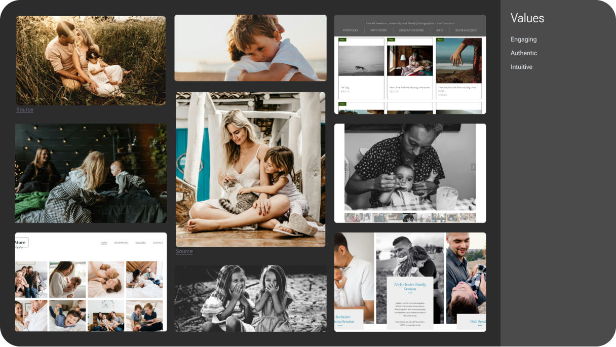
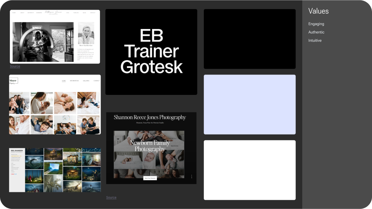
The design system intentionally embodies the service's core values: engaging, authentic and intuitive.
The simple color palette of white, black, and strategic lilac accents enhances the feeling of exclusivity and guides the user's attention to key actions.
We meticulously handpicked the photographer's best images to showcase her unique style, evoke authentic emotions, and tell a compelling story.
The website's overall aesthetic and personal touches create a sense of intimacy and exclusivity, giving users a deeper understanding of the photographer's personality and approach.
THE SOLUTION
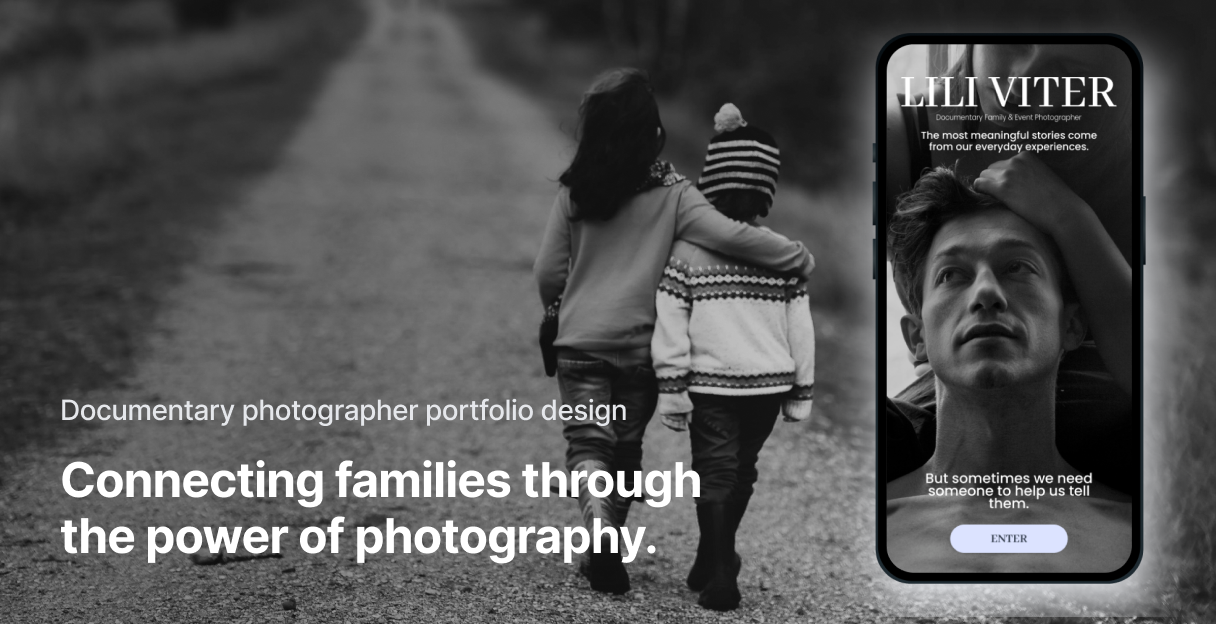
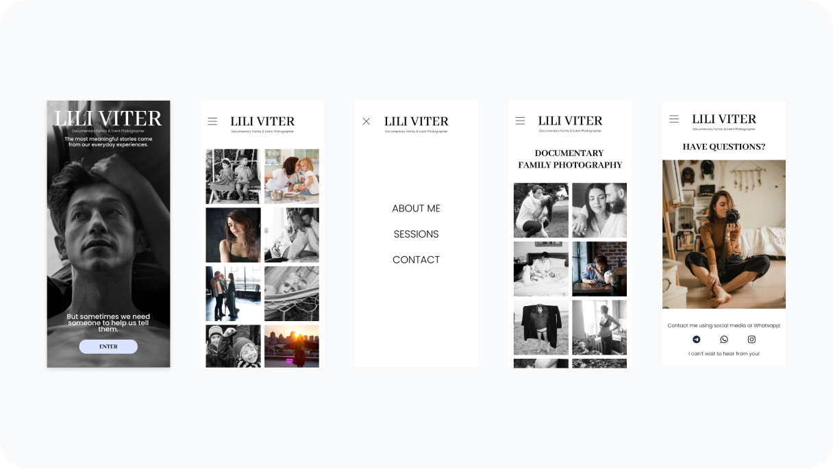
The visually captivating welcome page with a full-screen image carousel and prominent tagline instantly conveys exclusivity and sets the stage for a high-end experience.
It offers a glimpse into the photographer's work, sparking interest and enticing users to explore further.
The one-pager design directly addresses user needs by presenting essential information in a concise, easily digestible format.
The portfolio grid showcases the photographer's talent for capturing genuine emotions and storytelling through their images.
The "About Me" section adds a personal touch, fostering a connection with users who value authenticity.
For users seeking detailed information, the sessions page provides an in-depth look at each specific offering, including requirements, conditions, and price details.
This caters to those who have already established a connection and are ready to move forward, allowing them to directly contact the photographer and book a session.
The contact page caters to users who prefer alternative communication methods, offering various options besides WhatsApp.
A prominent picture of the photographer adds a personal touch, reinforcing the connection established on the main page and inviting direct communication.
ITERATION AND PRIORITIZATION
I gathered mobile prototype usability testing feedback through user interviews with 8 participants.
I led the effort by prioritizing and categorizing each feature based on severity and frequency of issues mentioned by users.
Then discussed them with the client.
We narrowed down our focus to three key options for incorporation into the launch:
IMPACT AND OUTCOMES
My goal for this project was to create an outstanding portfolio website that would highlight a documentary family photographer's unique services, showcase her personality, and connect her with a new European audience. I aimed to meet international standards and make her stand out in this competitive field. I believe I achieved this through a design that received a 10/10 net promoter score from users, who praised its visual appeal, exclusivity, and ability to create an emotional connection.
While the portfolio website may seem structurally simple, creating an emotional connection through design proved to be a rewarding challenge. It required a deep understanding of both the photographer's personality and the target audience's needs. Translating these insights into a website that resonates with viewers is a testament to my skills as a UX designer.
LEARNINGS
My most valuable lesson from this project was the power of inclusive design.
By prioritizing the needs and preferences of diverse users, I was able to create a product that was both aesthetically pleasing and accessible.
This experience reinforced my commitment to designing for inclusivity, ensuring that everyone can enjoy and benefit from my work.
Gathering and incorporating user feedback throughout the design process was crucial to create a product that truly resonates with and meets the needs of diverse users.
Considering accessibility and inclusivity from the outset of a project ensures a positive experience for the widest possible range of users, regardless of ability or preference.
Seemingly small design elements like color intensity and font choices can have a significant impact on the user experience, highlighting the importance of careful consideration and attention to detail.