UXR | UX | UI
Over the spring of 2024 I had an opportunity to be a part of a team developing home maintenance webapp. We’ve launched a viable MVP in very tight time constraints.
Feb-Apr 2024
Kat King
Polina Vinnikova
Adrienne Daniels
Nathanael Turley
Shivank Mishra
Figma design and prototyping
Whimsical wireframing
FigJam collaborative sessions
Google Sheets data analysis
Trello task management
User research
Information architecture
Interaction design
Visual design
Imagine finally owning your first home. You've completed the paperwork, secured the keys, but soon questions start piling up:
☹ How do I fix my garbage disposal?
☹ Can I manage my lawn and garden upkeep without breaking the bank?
☹ What exactly is a water heater flush, and how frequently should it be done?
☹ What is the difficulty level of a roof inspection?
☹ Should I hire a professional or do it myself?

The complexity of these tasks, coupled with time constraints and a lack of expertise, leads to anxiety, financial strain, and diminished property value over time.

Juggling home maintenance with other responsibilities, such as work and family, can lead to issues being neglected and accumulating over time.

Many homeowners lack the necessary knowledge and experience to identify and address maintenance issues promptly, resulting in costly repairs and decreased property value.

The high cost of major repairs and ongoing maintenance expenses adds to the financial burden, causing stress and frustration.

The sheer volume of maintenance tasks, coupled with uncertainty about how to perform them independently, contributes to feelings of overwhelm and anxiety among homeowners.
The timing to address these problems is ideal due to several factors:
UXR
We conducted an in-depth online survey for North Americans who were either homeowners or renting. We distributed these surveys via personal connections, LinkedIn, Co.Lab Discord server to homeowners or renters located in the US and Canada and collected 38 responses.
Data analysis revealed that the highest number of respondents lived with their spouse or partner, and many also residing with children, highlighting the importance of family-focused maintenance features. There was a mix of respondents that were living alone or with other configurations (roommates or parents), emphasizing the need to be inclusive of various household types.
Furthermore, the majority of respondents fell within the 30-59 age range and were mostly homeowners residing in single-family homes in suburban areas. This demographic profile indicated our primary target audience for our product.


THE DESIGN GOAL
IDEATION AND PRIORITIZATION
Now that we had a deep understanding of our users' pain points, desires, and needs, we began brainstorming solutions as a team to form a great product strategy.
Transitioning to secondary research, we shaped our product strategy and approach based on the insights gathered.
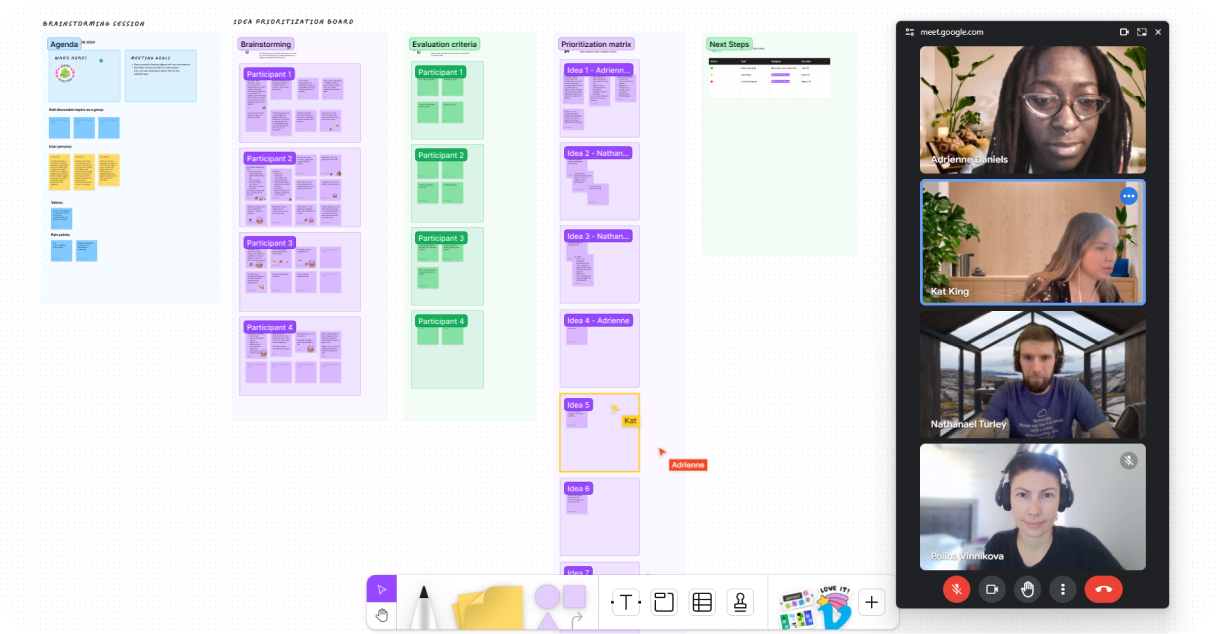
Our competitive analysis revealed a notable trend: proactive, scheduled maintenance wasn't a core focus of many larger platforms. Recognizing this gap, we proposed a combination of DIY content and a curated professional marketplace to build credibility and suit different customer needs. Subsequently, we prioritized these customer needs and created features based on technical feasibility.
DESIGN AND PROTOTYPING
However, before we could proceed with our strategy, we laid down a sturdy foundation – a comprehensive design system.
This design system would ensure consistency across all our screens.
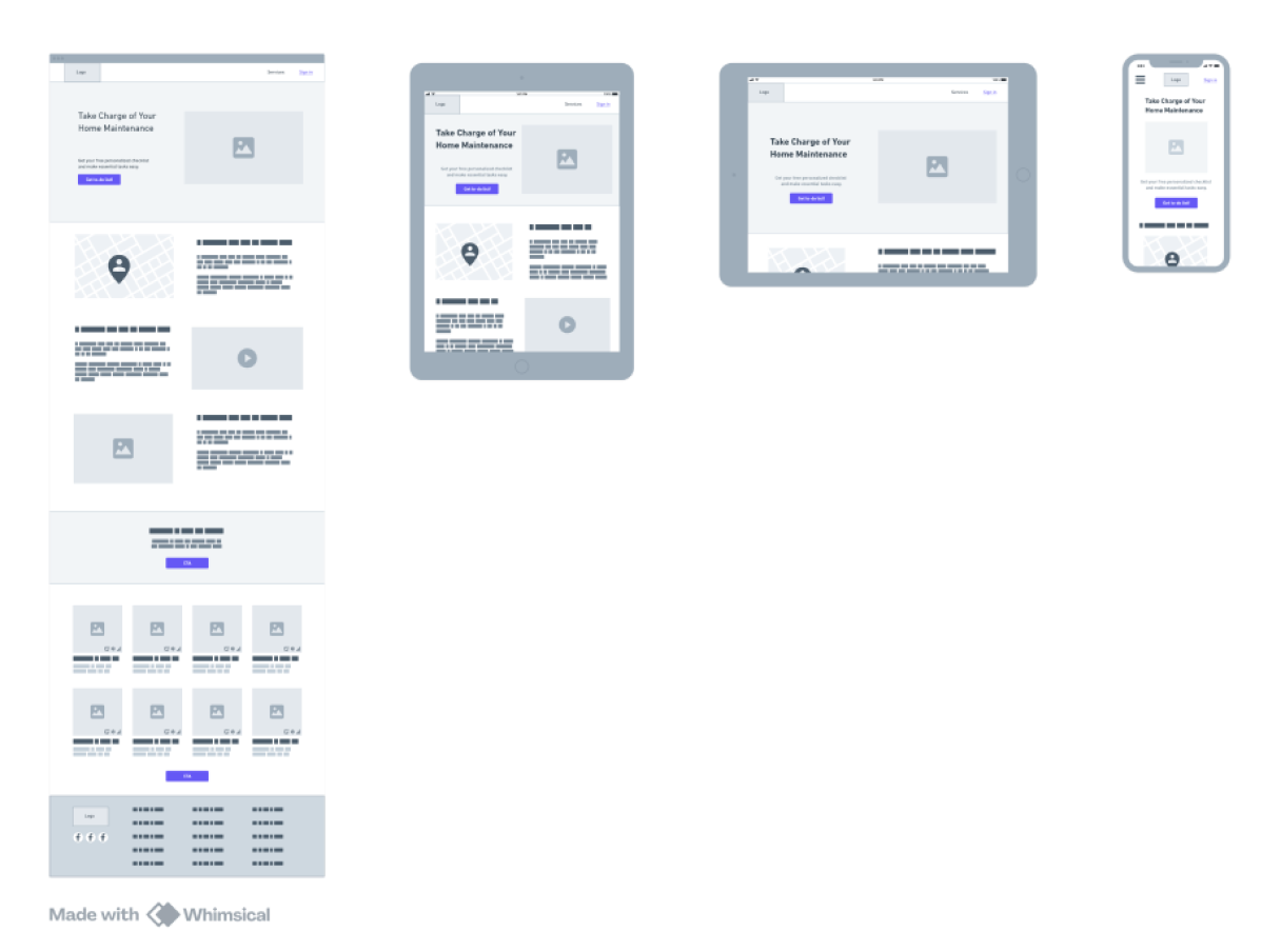
Given our tight schedule, we made a strategic decision to prioritize the desktop experience first and build a web application.
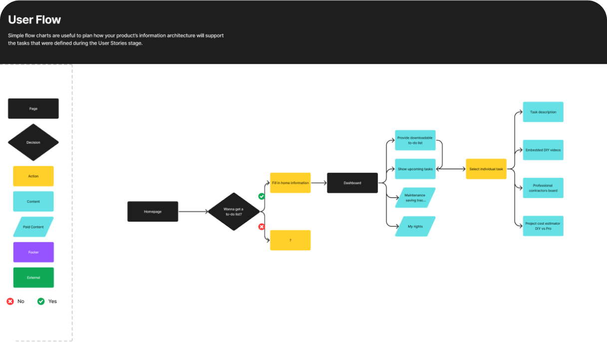
This allowed us to deliver the core user flow quickly.
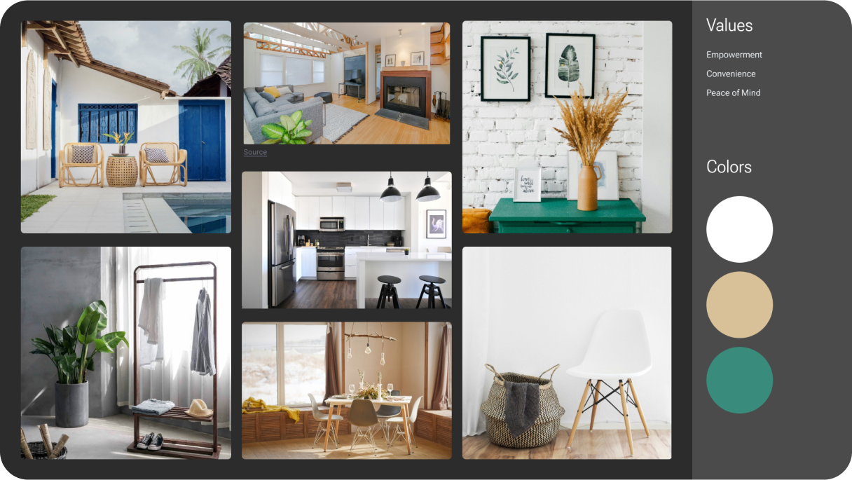

Our design system intentionally embodies our service's core values: empowerment, convenience, and peace of mind.

Our color palette is deliberately simple: whites, neutrals, and strategic green accents for important actions. This deliberate choice aids in establishing a clear visual hierarchy, directing user attention effectively.

Our layouts are meticulously designed to be clean and intuitive, ensuring users never feel overwhelmed or lost while navigating.

The overall aesthetic is designed to feel soothing and organized and mirrors the peace of mind you get from a well-maintained home.
THE SOLUTION
Our homepage details our method for creating a personalized maintenance list based on the user’s preferences and property type, emphasizing cost savings through DIY resources.
We also offer a glimpse into popular maintenance tasks to give the user a preview of what their customized list will include. This simplifies the user experience and guides them quickly towards personalization.
Our onboarding process simplifies user input by breaking it down into manageable steps.
Users select their property type - House, Condo, or Apartment, followed by indicating their amenities and any specific property requirements, such as outdoor areas or a garbage disposal.
This guided input keeps users focused and reduces errors.
Brief explanations alongside each question builds trust and motivate users to continue the process.
Our personalized dashboard shows only relevant tasks based on the user's selections.
Each task card has a consistent structure, featuring DIY difficulty level, category, and recommended frequency for completion.
This design promotes fast comprehension and easy prioritization.
Upon selecting an individual task, users are presented with options to view a DIY video tutorial and access a list of required materials.
We also provide a breakdown of the costs associated with DIY versus hiring a contractor, along with a list of recommended contractors.
This design prioritizes clarity and ease of use, encouraging continued utilization of HomeShield.
ITERATION AND PRIORITIZATION
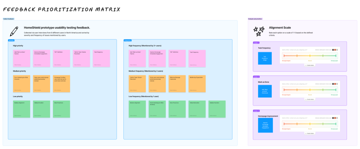
We gathered prototype usability testing feedback through user interviews with 8 participants from North America.
I led the effort by prioritizing and categorizing each feature based on severity and frequency of issues mentioned by users.
Using this matrix, we narrowed down our focus to three key options for incorporation into the launch:
We were pleased to receive overwhelmingly positive feedback, with an average rating of 9 out of 10 from users.
IMPACT AND OUTCOMES
This internship project aimed to create a viable home maintenance MVP within 8 weeks. Our team not only achieved this goal but also secured the top spot among seven competing teams. This demonstrates my ability to be a valuable team member and contribute to high-performing teams that deliver results.
The project successfully addressed user needs by providing a valuable service to help manage home maintenance tasks and access relevant information.
User testing resulted in a 9/10 net promoter score and positive feedback highlighting the clean design and ease of use. Although the project was discontinued post-internship, its success underscores the team's ability to create a valuable product within tight constraints.
LEARNINGS
Overall, our team journey was both challenging and immensely rewarding. As we faced strict deadlines and limited time, we dedicated long hours and made personal sacrifices to develop our product. At times, some of us even faced imposter syndrome and made us question our own abilities.
However, through our hard work, we gained invaluable experiences and had the opportunity to collaborate within a cross-functional team. We learned the significance of asynchronous updates and maintaining constant communication. We also learned that great products are built by teams, not individuals!

Learning to see my design choices through the eyes of developers and product managers made me a better designer.

I loved working within an agile system! The daily standups, regular meetings, and retrospectives kept us focused and helped us learn from our mistakes quickly as a team.

Tools like FigJam helped me lead collaborative sessions on brainstorming, feature prioritization, and usability feedback.